Scientifica
Designing a corporate identity for the (fictitious) science centre “Scientifica” was the assignment for my diploma project. As the final project of my education, its purpose was to showcase and use all the knowledge I had acquired after 4 years studying interactive media design.
The brief included the creation of the following elements: a logo, a magazine as well as a set of three additional covers, a website, a newsletter, two promotional videos as well as an animated jingle, a promotional item and the museum’s signage.

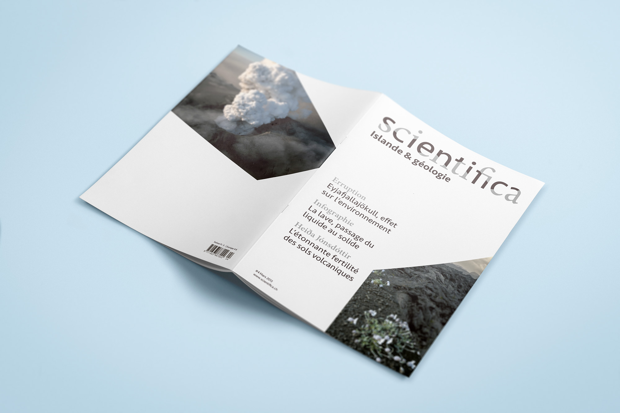


↑ The magazine and its additional covers. | ↓ Inside of the magazine.
Concept
I based my concept on the idea that the purpose of science is to explain things that might seem natural, simple and trivial to us with formulas and concepts that most people find complicated. Yet if one considers there are actually two layers: the somewhat elitist science with its complicated equations, and the innate, unconscious science, that brings together everything known and understood by all. Then, one can see that these two layers mean the same thing, only in different ways. I wanted to explore this idea of the simple and the complicated, which ultimately share the same meaning.
↓ Promotional item – a box with magnets representing various sciences.


Implementation
Graphically, I decided to do a play on these two reading levels and to put them in direct confrontation and did so in two ways.
Font choice & logo
I chose to experiment with typography by opposing two different font styles (serif and sans serif), the first one representing the elitist/complicated science and the second the unconscious/simple science. I wanted both font styles to be used in each of the logo’s letters, thus symbolising the idea that these two sciences are present everywhere. To achieve this, every glyph is cut horizontally at a randomly chosen height and angle. To make the separation a little clearer, I used a different colour for each font.
Grids
Based on the cut-out angles of the logo’s letters, I created a grid that I later used for images. To contrast with this “irregular” grid, I used a more structured and basic grid for the text. The goal in doing so was also to express the two sciences.
↓ 20 sec promotional video & animated jingle