Rampini – annual report
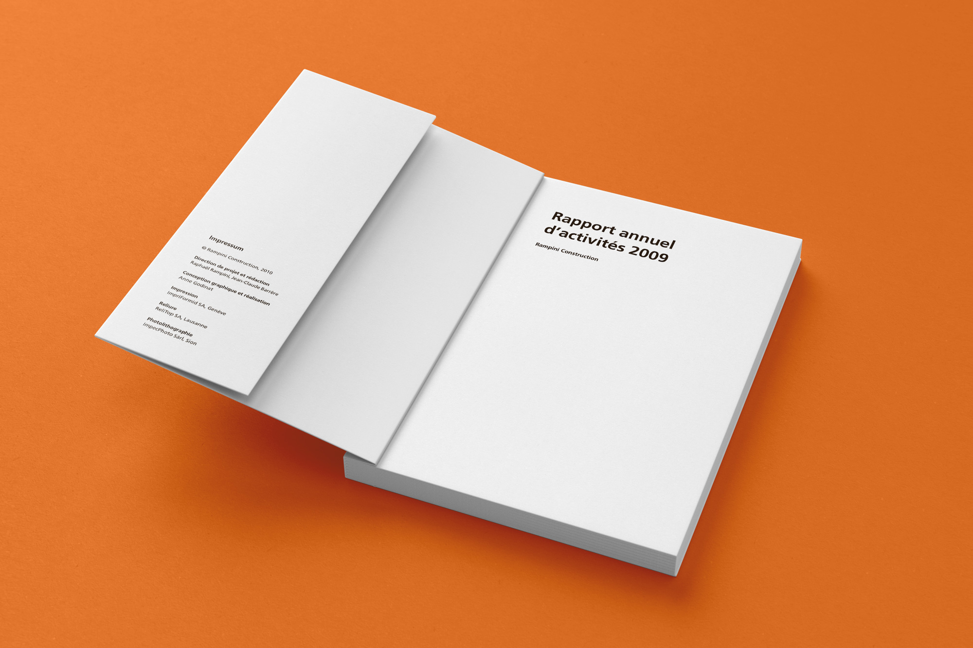
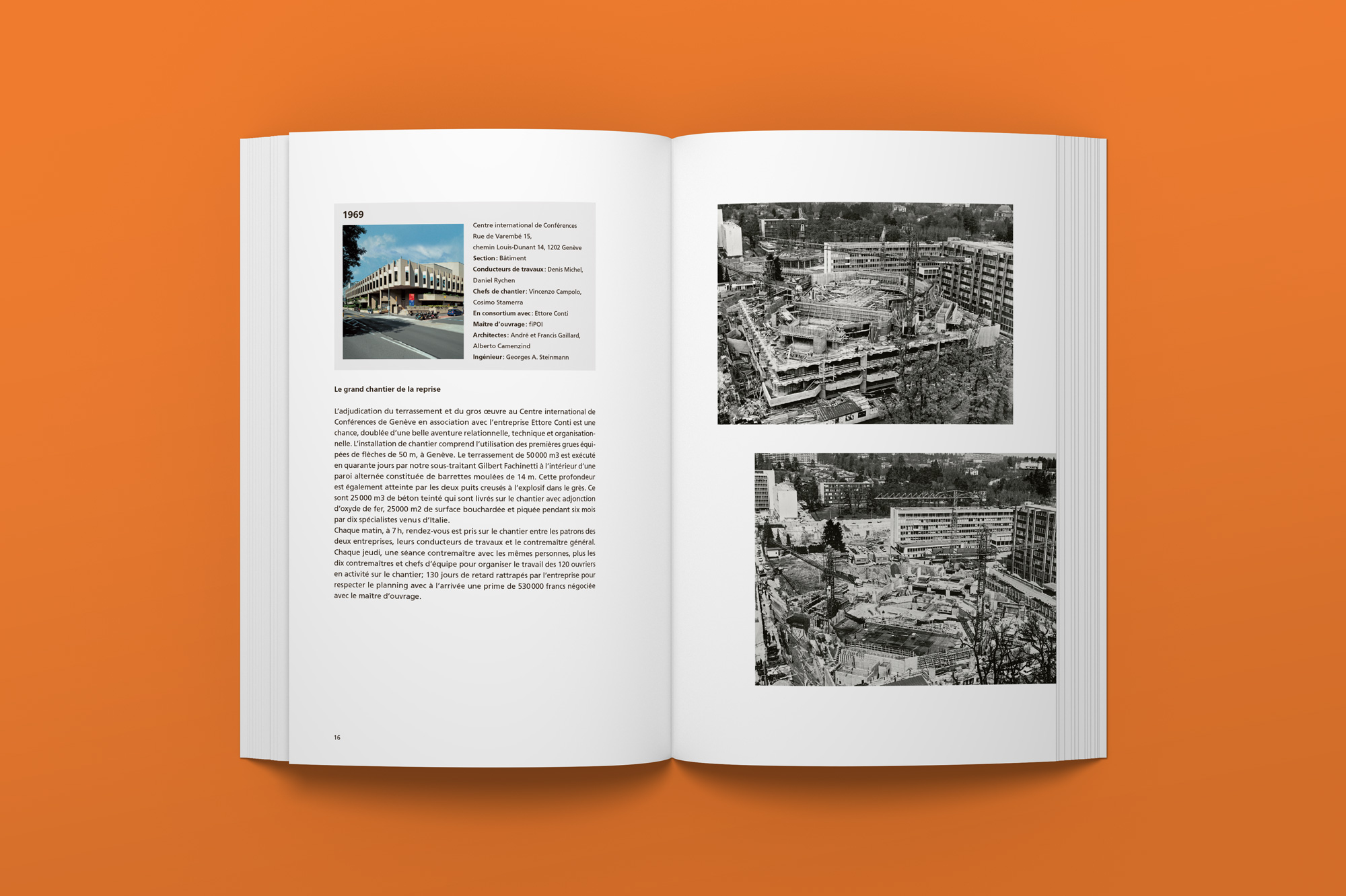
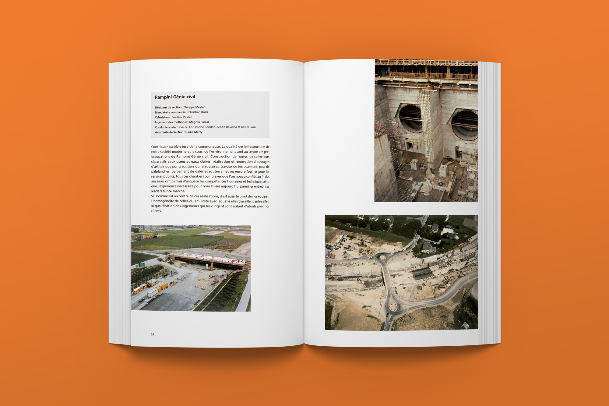
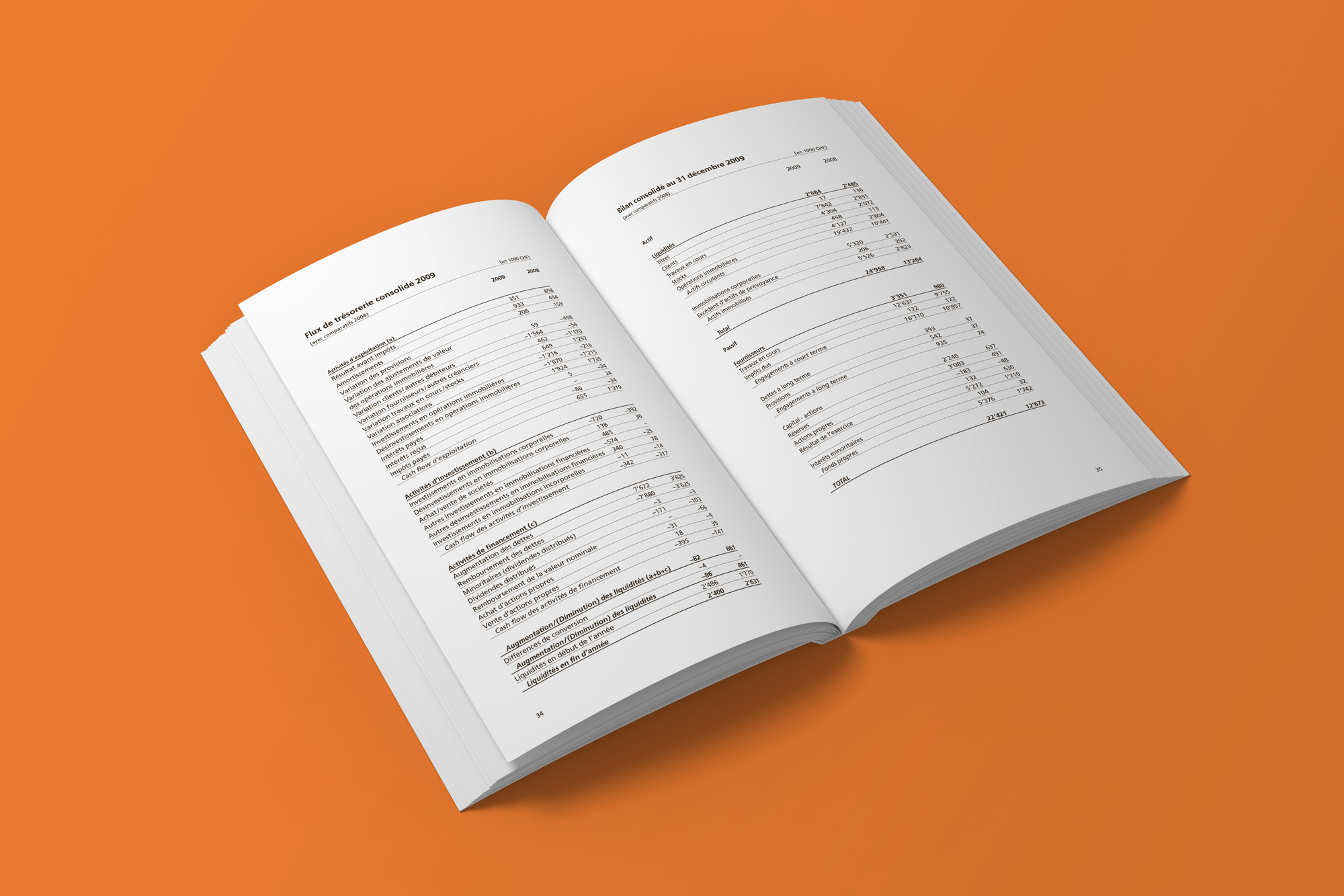
With this project created within a typography course, the goal was to design an annual report with some realistic constraints, i.e. we were provided with the content (text and photos) and had to include all of it, and some images couldn’t be cropped. We were, however, free to choose the document’s format, as well as all typographical details (margins, grid, font, font size, etc.).
I chose a format with about the same proportions as A4 but slightly smaller so that you can hold it comfortably in your hand, which makes reading easier.
For the typeface, I chose to work with Frutiger because it’s a modern typeface with good legibility, which I thought was a good fit for this type of work.
Client
School project (typography)
Type of project
Editorial, annual report
Year
2011

