National Youth Accordion Festival
Working with the Swiss National Youth Accordion Orchestra, I carried out a complete redesign of their visual identity, starting with the logo. As the accordion is an instrument that takes many forms, I chose to use the bellows as a central element of the logo – a part common to all its variants – in order to represent all the musicians in an inclusive and recognisable way.
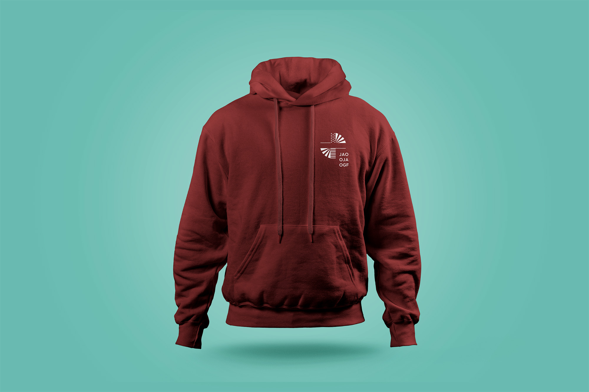
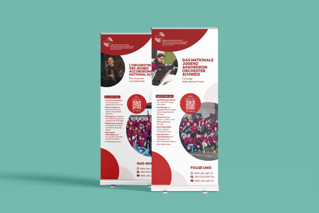
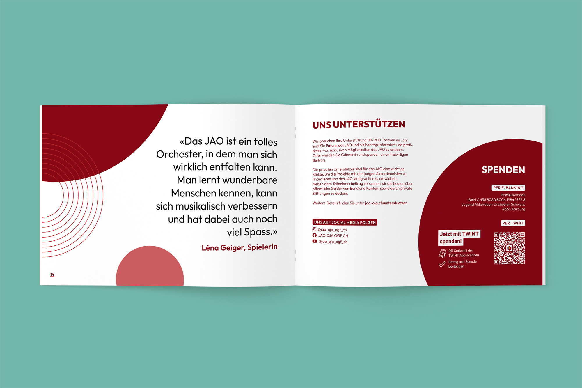
In my role as marketing head on the orchestra’s committee, I then implemented the new identity through various printed materials (flyers, roll-ups, business cards, stationary, …) and updated the website to reflect the new graphic direction. I also designed a number of promotional items (sweatshirts, T-shirts, pins, etc.) aimed at raising the orchestra’s visibility and bringing its members together.
This page presents an overview of the different media created as part of this project.
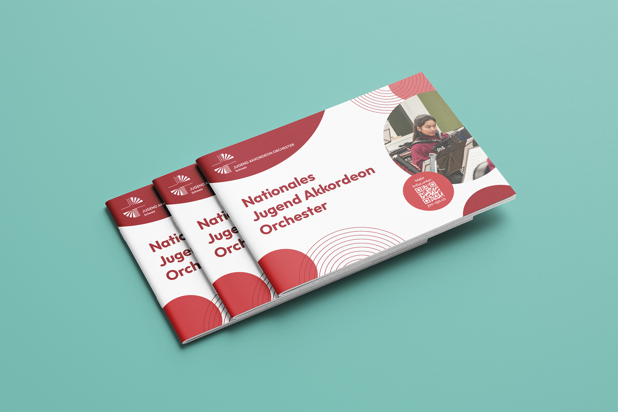
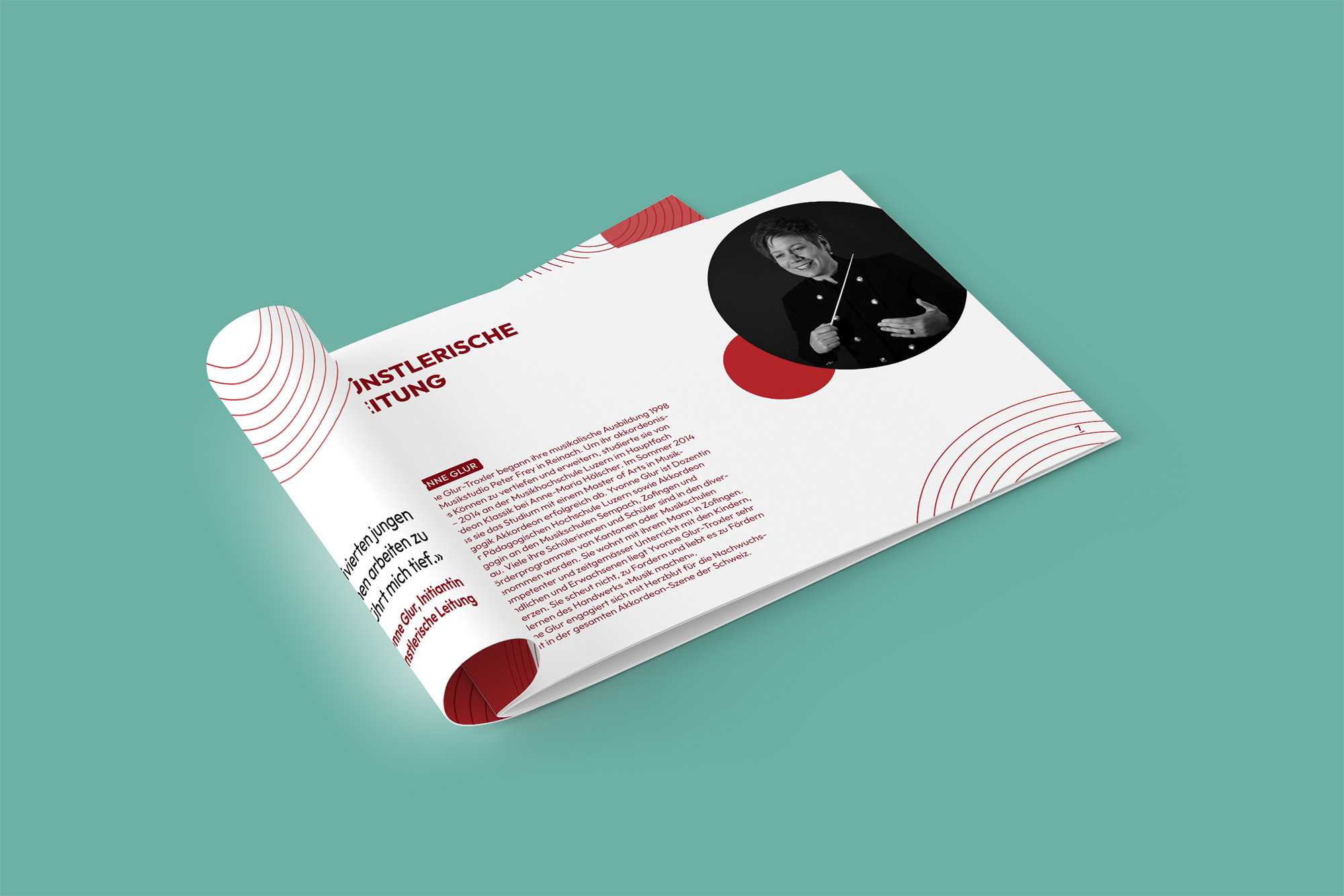
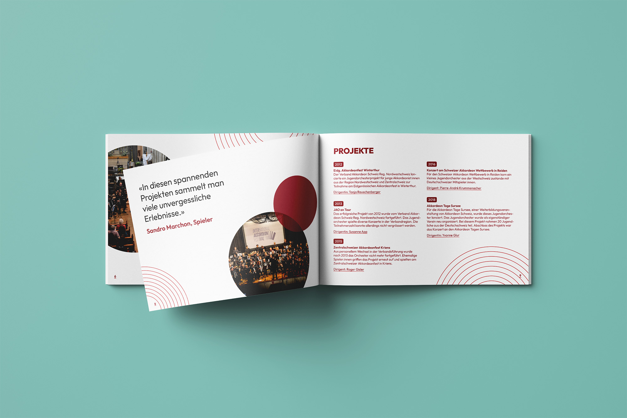
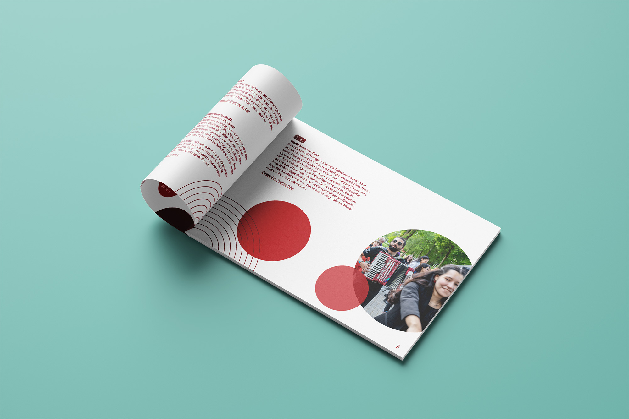
↑ Various printed media | ↓ Sponsorship dossier
↓ Promotional items aimed at raising the orchestra’s visibility